Local Artist: Graham Watts Original Art Vancouver To Whistler
"Arctic Tranquility - Polar Bear" Painting by Graham Watts
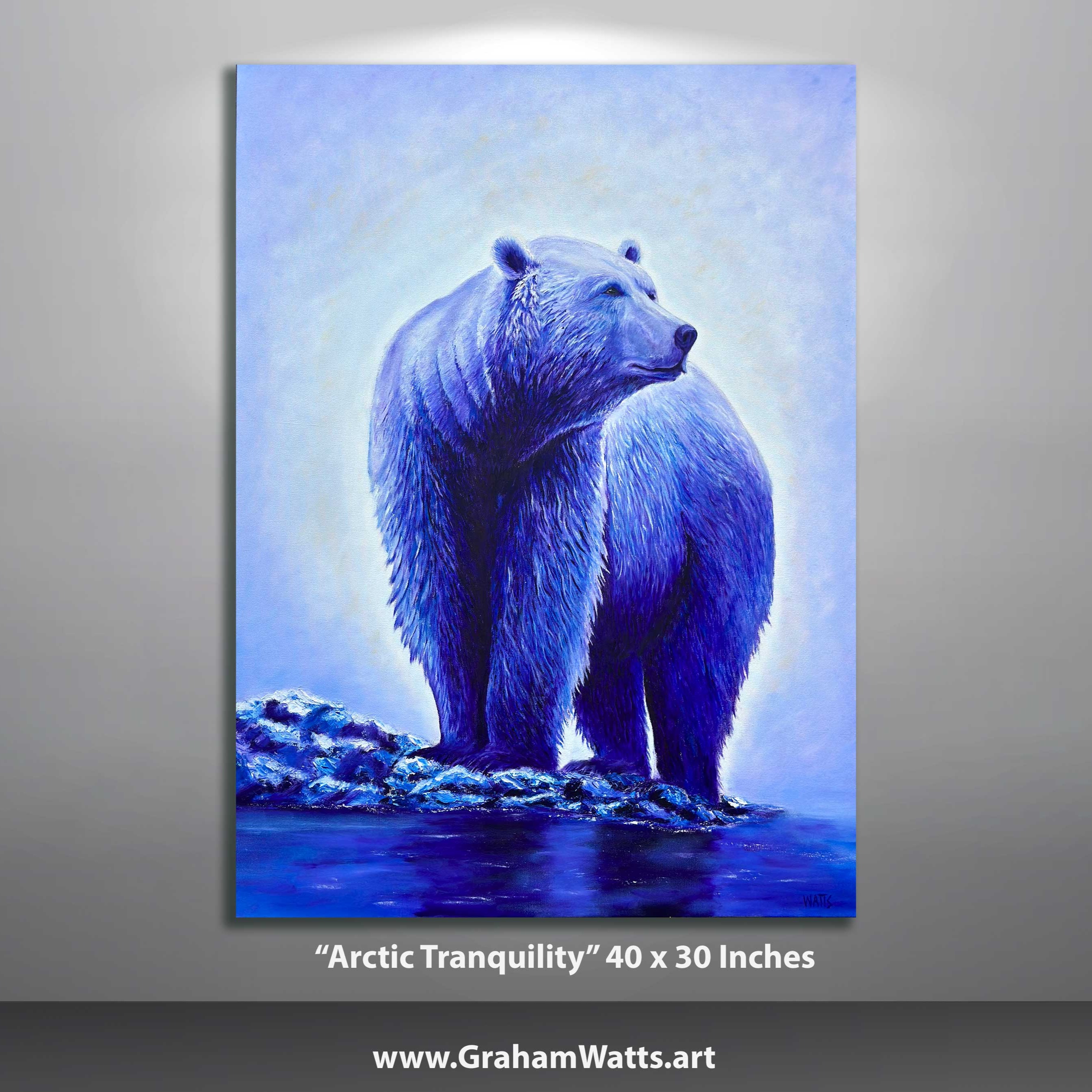
Hey everyone, and welcome to another deep dive. You know that feeling you get when you look at a painting and you're just like pulled into its world. - Absolutely, yeah. - That's what we're looking at today with this piece called Arctic Tranquility. It's this stunning painting of a polar bear. But we're not just gonna like tell you, oh, it's pretty and move on. - Right. - We're gonna deep dive into why it's so impactful. - Right. - And maybe even learn a little something about art along the way. - I like it. - So picture this, a canvas, almost three feet by four feet, right there in front of you. Big, bold, and dominated by this polar bear. The description we got uses the words stunning and vivid and honestly, spot on, but is the bear's pose that I think really gets me. - Okay, yeah. - It's not just hanging out on iceberg or anything like that. This polar bear is serene, peaceful, but also super powerful. - Yeah. - Kind of a cool combo when you think about it. What do you think? - Totally. And I think the artist really emphasizes that actually with how they use color in this painting. - Okay. - So the background is this soft, light, blue. Think like the sky you see right as the sun starts to set below the horizon, almost merging with the ice. - Okay, I can see that. - Yeah, and here's the thing. The polar bear itself, also blue. - Oh, wow. - Yeah, no stark white fur, nothing like that. It's blue on blue. - Interesting. So it's blue on blue, huh? See it's a little counterintuitive to use blue for a polar bear. What's the thinking there? - So this is called a monochromatic color scheme. And honestly, it's really effective, I think. - When you use different shades of the same color, like blue here, for the bear in the background, you're not exactly going for like strict realism, right? - Right, right. - It's more about playing with light and shadow. And you can do that in a really subtle way when you've got all these different shades of the same color to work with. - Okay, yeah, no, you've got me hooked now. Tell me more about this whole light and shadow thing. - Yeah, so it's all about this thing called kiaroscuro. - Okay. - Which is a very fancy art term. - Of course it is. - Right, for how light and dark shades interact with each other, it's basically by using all these different shades of blue, especially in the way that they blend and contrast, you know? The artists can create this incredible sense of depth and texture in the bear's fur, almost like you could reach out and touch it. Like if they'd gone with just straight white fur, on that blue background, it'd be flatter, not as captivating. So it's like this very deliberate choice that kind of pulls your focus in right to the bear, all those small details in the fur, no distractions. - Exactly. And that ties in so well with the title of this painting too, Arctic Tranquility, that limited color palette that focus on just the bear and its surroundings, it all builds this feeling of peacefulness, vastness, solitude, things that we associate with the Arctic. - Makes sense, yeah. It makes me wonder though, what's the deeper meaning here? - See, and that's where things get really interesting, because art, it's always open to interpretation. So what does this painting say to you about polar bears? - We often think of them as these fierce creditors, which they are. - But here, in this piece, there's also this calmness, almost like a majesty, to this bear. And I think that really challenges how we might normally picture them, right? - That's true, yeah. I mean, I'm feeling this sense of awe and respect for them, just from talking about this. - And we can take that a step further too. Think about the Arctic. This artist could have put this bear anywhere, right? - Right, right. - But that choice of color, that vastness of the blue, makes you feel the isolation, the beauty, even the fragility of the environment, especially with climate change and all that. - Really powerful point, it's not just a painting. It's this whole conversation starter. - Exactly, yeah. So next time you're looking at a piece of art, any piece. Try to push yourself to look past what you just see at the surface. Ask yourself, what is this artist trying to make me feel? How are they using color? How are they using light composition, all that, to make me feel that? You might be surprised what you discover. - Love that. Well, we did it, folks. We took a deep dive into Arctic tranquility. And I think we came back with a new appreciation for polar bears, art techniques, and the stories that colors can tell. - It was fun. - Thanks for joining the dive, everyone.