Local Artist: Graham Watts Original Art Vancouver To Whistler
"Overlord Mountain & Fissile Peak - Whistler BC" Painting by artist Graham Watts
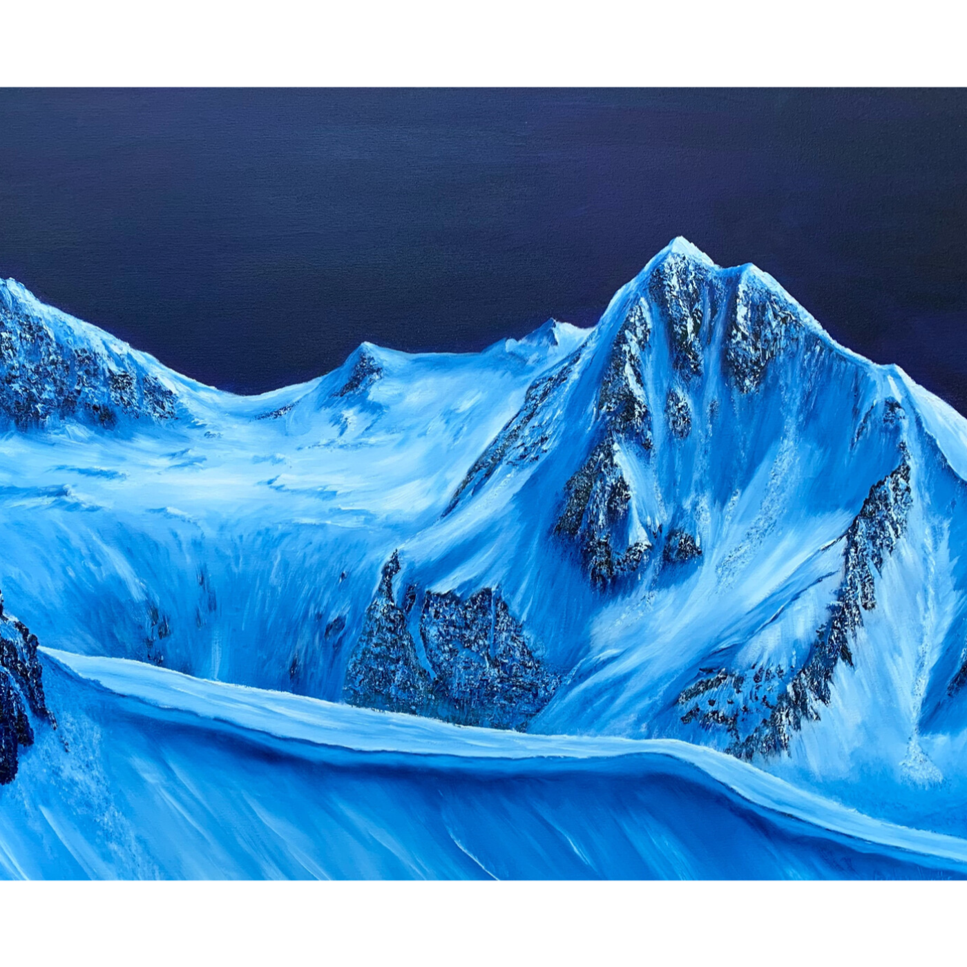
I forget the feeling that sometimes when you look at a painting, it's more than just paint on canvas. There's a whole story just waiting to be... Waiting to be cold, yeah. Told, exactly. And that's what we're doing today, a deep dive into a single work of art. All right, I like it. It's called Overlord Mountain with Fissile Peak by Graham Watts, and let me tell you, the title alone... Yeah, it's traumatic. It grabs you. So we've got the artist's description here. Oil on canvas, pretty standard, 30 by 40 inches. But it's the subject, Overlord Mountain, a peak you can actually see from Whistler Blackcomb, and then he hits you with monochromatic style. What's your take on that as an art expert? Well, first of all, it's not just a random choice, right? Monochromatic palettes, especially in landscapes, they kind of hone in on certain emotions. Yeah, he mentions Prussian blue, titanium white. Right away, you're in this cool, almost crisp headspace. Yeah, yeah, I get that. Makes you think about the season, the time of day. Totally. And here's another thing. He says the original inspiration was a photo. So how do we feel about that? Does that, like, I don't know, make it less original? That's the million dollar question, isn't it? Ever since photography came along, people have been debating that. Right, right. But, look, artists have always used visual aids. Sketches, studies, even way back in the day, projecting images with a camera obscura. No kidding. A photo is just another tool in the toolbox. Helps the artist capture a moment, the way the light hits something before it's gone. Doesn't make it less artistic. Just adds a layer to the process, you know. Huh, it's like those super realistic landscape paintings. Makes you wonder if there was a whole hidden sketch pad behind that majestic oak tree or whatever. Exactly. And speaking of setting a mood, those colors he mentioned, Prussian blue and titanium white, not your typical mountain vista palette. Definitely not. Prussian blue is interesting, invented in the 1700s. Back then, it was often associated with, like melancholy, often used in seascapes. So using it for a mountain adds a different dimension, maybe a sense of isolation or the vastness of geologic time. Wow. And the titanium white, it's not just there to brighten things up, it's that crisp contrast against the blue, almost like you could feel the mountain there. You're totally drawing me in. So we've got the color choices, but then there's the size. 30 by 40 inches, that's not exactly something you tuck away in a corner. Right, size matters in art. 100%. 30 by 40, that's a statement piece. Invites you to spend time with it, but it's not overwhelming. Right. Probably meant for a more intimate setting. A place where you can really get lost in those cool blues and whites, all those subtle details. We've covered a lot of ground here. The artist process, the history behind the colors, even how the physical size of the painting changes how we experience it. It's amazing what you can uncover when you really start to dig in. Yeah, absolutely. And here's something else to think about. The description mentions Overlord Mountain being visible from Whistler Blackcomb. So if you really want to get a feel for this painting, try to find a picture of both. See how Watts took a real place with all his natural colors and details and turned it into this striking monochromatic image. Does it change how you see the mountain? It's like he's telling a different kind of story with those colors. Okay, exactly. Wow, what a great deep dive.